It’s no secret that I absolutely love Phthalo Blue. (It’s pronounced THAY-low.) By itself, Phthalo is a beautiful vibrant blue, and when mixed with Cadmium Yellow, it makes a range of fantastic bright greens that I absolutely adore. However, I have found that Phthalo Blue makes terrible, muted, murky, gray purples. This is because I use Phthalo Blue Green Shade, which has a bias away from purple on the color wheel.
A moment to talk about color theory, for the uninitiated: Color theory for light is different than color theory for pigment. As my girlfriend loves to remind me, “true red” in lighting is represented by the hex code #FF0000, which means that the light source is emitting one hundred percent red light, and zero percent green or blue light. In paint, however, light is reflected, not emitted. As such, there is no such thing as a “true red” as the chemical makeups of the pigments naturally reflect multiple wavelengths of light. Because there is no “true” primary pigment, all pigments have something called a bias.
Think back to the basic color wheel that you learned in kindergarten. You were taught that there are three Primary colors from which all the others are mixed: Red, Yellow, and Blue. Then you have the Secondary colors: Orange, Green, and Purple. The important part to remember now is the Tertiary colors, the ones that are between the Primary and Secondary colors. These are colors like Red-Orange or Yellow-Green or Blue-Violet. These tertiary colors represent the bias of paint pigments.
Here is a diagram by Rebekah Shaw (Cookies and Color at LoveAtFirstBiteYork.Blogspot.com) using frosted cookies to show color bias as tertiary colors:
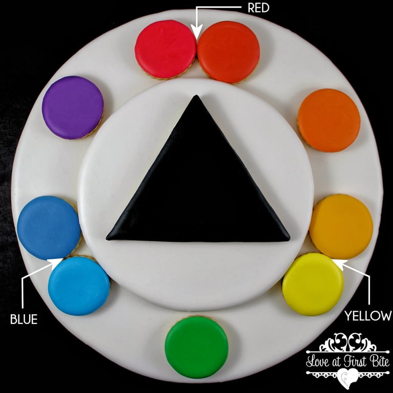
As you can see, the reds, yellows, and blues lean towards or away from the secondary colors. While the two colors at the top would both conventionally be called “red”, the reality is that the one on the left is actually red-violet and the one on the right is red-orange. There is no red pigment that does not bias one way or the other, nor is there a yellow one or a blue one.
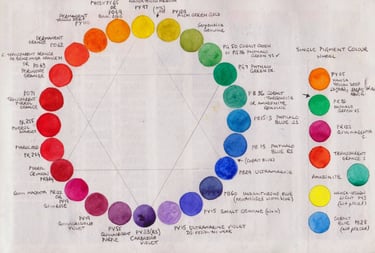
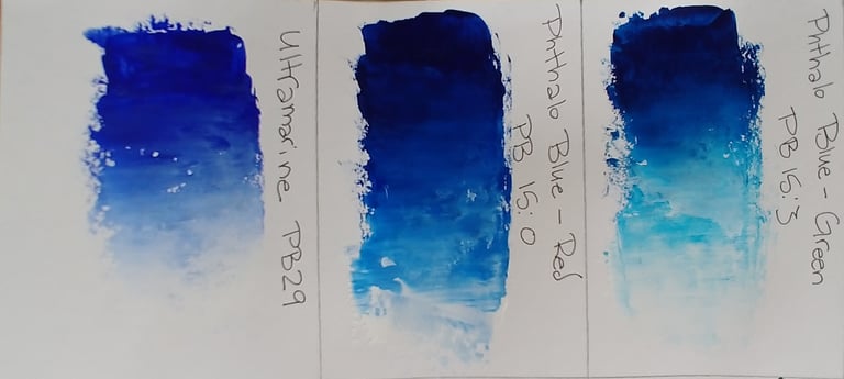
This is why my beloved Phthalo Blue Green Shade makes terrible purples; It biases towards green and away from purple. Usually, I use Ultramarine Blue to mix purple, and as you can see from my gallery, it does the job well. Recently, however, I was introduced to a new pigment: Phthalo Blue Red Shade. The name implies that this blue will have a red/violet bias, but how does it compare to Ultramarine?
This single-pigment color chart by Jane Blundell (janeblundellart.blogspot.com) implies that Phthalo Blue Red Shade has less of a red bias than Ultramarine does, but doesn’t show how any of these colors mix with each other:

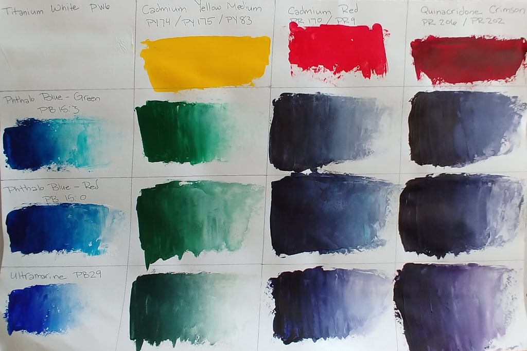
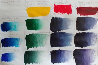
There are many examples on the internet comparing two of these blue pigments to each other, but none that compare all three. So, I’ve done it myself with acrylic paint, and I’m sharing it with all of you in the hopes that you won’t be as frustrated looking for these swatches as I have been.
Here are the blues that I mixed, with their pigment codes:
Golden Ultramarine Blue (PB29)
Golden Phthalo Blue Green Shade (PB15:3)
Golden Phthalo Blue Red Shade (PB15:0)
Here’s a list of what I mixed with these blues, and their pigment codes:
Red-Orange: Liquitex Cadmium Red (PR170 + PR9 blend)
Red-Violet: Golden Quinicridone Crimson (PR206 + PR202 blend)
Yellow-Green: Golden Cadmium Yellow (PY74 + PY175 + PY83 blend)
White: SOHO Titanium White (PW6)
I did not use a Yellow-Orange, as I don’t use one in my general pallet, and I personally wouldn’t mix any blue with a yellow-orange anyways as the color would be incredibly muted and bland.
(What are pigment codes, you ask? They represent the specific chemical pigment in the paint. Different brands will use different names for their paint colors, but the pigment codes are standardized across brands to specific chemical compounds, whether organic or inorganic. For example Grumbacher calls one of their watercolors “Cerulean Hue” while Winsor and Newton calls it “Intense Blue”, but both brands use the pigment PB15, also known as Copper Phthalocyanine. Pigment codes only give information about pigments and don’t provide information about anything else in the paint, such as binding agents.)
So, without further ado, my comparative color chart:
My conclusion about Phthalo Blue Red Shade in less than 15 words: It's a true compromise – In the end, no one gets what they want.
Phthalo Blue Red Shade is a bit of a misnomer, as it doesn't actually have a red/violet bias. It still has a green bias from its copper origin, it just isn't as powerfully biased as Phthalo Blue Green Shade. It makes nice enough greens and purples, but Phthalo Blue Green Shade makes better greens, and Ultramarine Blue makes better purples. If I had to have only one blue on my pallet, I might choose this one for its versatility, even though the colors it mixes are more muted than I would like. But in what scenario would I limit myself to only one blue in my pallet? Instead, I can have two pigments that play to their own bias strengths and together provide a more vibrant array of colors.
One thing that I do like about Phthalo Blue Red Shade is that by itself, it is a nicer warm blue than Ultramarine. When mixed with the Titanium White, Ultramarine Blue looked muted and almost gray, whereas Phthalo Blue Red Shade provided vibrant hues. So by itself, Phthalo Blue Red Shade has a leg up on Ultramarine. It just doesn't play nicely with others.
Speaking of not playing nicely with others, in researching Phthalo pigments, I read multiple times that they are much stronger than other blue pigments, and hoo boy did I find that to be true. A little Phthalo goes a long way, for both the Red and Green shades. Since all three blues that I tested were Golden brand, this wasn't an issue of one brand being more generous with their percentage of pigment than another. The Phthalo pigments were just more powerful than the Ultramarine, which made them more difficult to mix well, including being less responsive to being mixed with the Titanium White.
Phthalo Blue Red Shade was an interesting experiment, but in the end, I was rather disappointed with it. I found that is wasn’t worth the cost, or the time that it took to hunt it down, when other pigments are better at what they do and are more easily available. It just isn't the right pigment for me.